
Adding Graphs to a Graph Frame
A Graph is a special runtime object, which can reside only inside a graph frame. There are two types of graphs available: Overlay and PolyGraphs. A single graph may hold and display multiple curves, where all curves in a graph are based on the same y-axis scale.
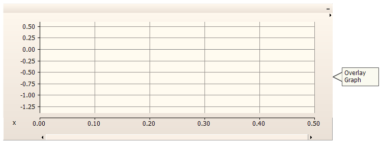
The following illustrates a graph frame with an overlay graph at the top and a polygraph below it.
Graph frames may accommodate single or multiple graphs. To add one or more graphs, right-click on the frame title bar and select Add Overlay Graph (Analog) or Add PolyGraph (Analog/Digital). You can also add an overlay graph directly by pressing the Insert key on your keyboard with your mouse pointer over the graph frame.
Once multiple graphs have been added to a frame, you may change the order in which they appear. Right-click over the graph to be moved and select one of the following:
Move Graph Up
Move Graph Down
Move Graph to Top
Move Graph to Bottom
Right-click over the graph to be cut (removed)/copied and select Cut Graph/Copy Graph respectively. Once a graph has been cut or copied it may then be pasted into the same or another graph frame, or to an external application as an image. See Smart Paste.
Cut or copy a graph as described above. Right-click on the graph frame title bar and select Paste Graph. A graph may be pasted multiple times, where each paste will replicate the entire graph.
All graphs may be collected, viewed and modified in a convenient table called the parameter grid. For more details, see the Parameter Grid Pane.
If a simulation has been run and your graph contains curve data, you have the option of copying all or a portion of all curve data to the clipboard. Right-click over the corresponding graph and select Copy Data to Clipboard and then select one of the following from the pop-up menu:
All: Copies all curve data available.
Visible Area: Copies all curve data visible in the graph window.
Between Markers: Copies only curve data situated between markers. Note that Show Markers must be selected in the Axis Properties dialog.

The data is copied as Comma Separated Variables (*.csv) format for easy migration into common data analysis software.
Overlay graphs are the most common and familiar type of online plotting tool in PSCAD. These graphs display measured data as a function of time, where multiple curves may be added (or overlaid on top of each other) onto a single graph.
Left double-click on the desired overlay graph, or right-click on the graph and select Edit Properties.... This will bring up the Overlay Graph Properties dialog window as shown below:

There are various parameters that may be edited through this window, each of which are described below.
Preferences:
Glyphs: Select Show or Hide. Selecting Show will display glyph symbols on all curves in the graph.
Grids: Select Show or Hide. Selecting Show will display grid lines for the x-axis and y-axis major grids.
Grid Line Colour: Select a colour for the grid lines.
Curve Colour Pattern: Use this option to manually adjust the first 6 curve colours for the graph.
Curve Inverted Colour Pattern: Use this option to manually adjust the first 6 curve colours for the graph, while in Invert Colours mode.
Ticks: Select Show or Hide. Selecting Show will display major grid tick marks along the y-axis intercept line.
Y-Intercept: Select Show or Hide. Selecting Show will display the y-intercept (horizontal) intercept line. The y-intercept line can be adjusted using the Y-Intercept field described below.
X-Intercept: Select Show or Hide. Selecting Show will display the x-intercept (vertical) intercept line. The x-intercept is always at time zero, and cannot be adjusted in overlay graphs.
Crosshair: Select Enable or Disable to control cross hairs mode.
Invert Colours: Select this option to give the graph a black background (instead of white or yellow).
X-Axis (Display Only):
X-Axis Title: Specifies the x-axis title (located on the left-bottom corner of the graph).
Intercept Value: Specifies the x-intercept value.
Minimum X-Value: Specifies the minimum x-axis viewing limit on the graph.
Maximum X-Value: Specifies the maximum x-axis viewing limit on the graph.
Y-Axis:
Manual Scaling Only: Select this feature to lock the y-axis limits set in Minimum Value and Maximum Value. The y-axis will remain locked during any subsequent zoom operations.
Y-Axis Title: Enter text for display as the graph title (located on the left side of the graph).
Grid Size: Specifies the y-axis grid interval. To view the y-axis grid lines, adjust the Grids option to Show.
Minimum Value: Specifies the minimum y-axis viewing limit on the graph.
Maximum Value: Specifies the maximum y-axis viewing limit on the graph.
Intercept Value: Specifies the y-axis location of the y-intercept line. This line is only visible if Y-Intercept | Show is selected.
Margin: Sets a y-axis padding for when smart zooming, ensuring that all curves are displayed, even when at the edge of the zoom.
Polygraphs are used specifically to display plotted curves in a 'stacked' format. That is, each curve is contained within its own viewing space, and is stacked one atop the other. A polygraph may be chosen over a standard overlay graph if the user needs to either view many single-curve plots in a compact space, or to make use of the curve digital style functions to create a logic transition diagram:

Left double-click on the desired polygraph, or right-click on the graph and select Edit Properties.... This should bring up the Poly Graph Properties dialog:

There are various parameters that may be edited though this window, each of which are described below.
Preferences:
Curve Colour Pattern: Use this option to manually adjust the first 6 curve colours for the graph.
Curve Inverted Colour Pattern: Use this option to manually adjust the first 6 curve colours for the graph, while in Invert Colours mode.
Grid: Select Show or Hide. Selecting Show will display grid lines for the x-axis major grids.
X-Intercept: Select Show or Hide. Selecting Show will display the x-intercept (vertical) intercept line. The x-intercept is always at time zero, and cannot be adjusted.
Bands: Select Show or Hide. Selecting this option will give a different background colour between multiple curves in one graph, for easy visual differentiation.
Margin: Enter a value to force white space between the curve maximum value and the margins of the display area.
Crosshair: Select Enable or Disable to control cross hairs mode.
Invert Colours: Select this option to give the graph a black background (instead of white or yellow).
X-Axis (Display Only):
X-Axis Title: Specifies the x-axis title (located on the left-bottom corner of the graph).
Intercept Value: Specifies the x-intercept value.
Minimum X-Value: Specifies the minimum x-axis viewing limit on the graph.
Maximum X-Value: Specifies the maximum x-axis viewing limit on the graph.